Does the term “data visualization” sound like a dyed-in-the-wool twenty-first century phenomenon? If the phrase only conjures images of computer generated infographics, that constitutes just a snapshot of the long history and tradition of data visualization.
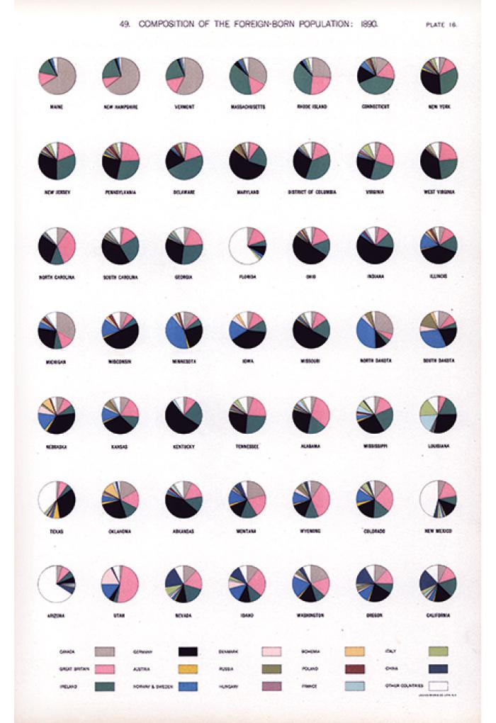
Image credit: Gannett, Henry. Statistical Atlas of the United States: Based on Results of the Eleventh Census. Mis. Doc. (United States. Congress. House), 1898.
Data visualization which is a way of making information easier to understand through visual presentation and arrangement has its origins in diagrams of celestial bodies, maps and thematic representations of the known world, some of which date to the 7th millennium BC.
These pictorial presentations combine art, science and statistics to map everything from time, distance and space to geology, economics, demography and health data.
A new exhibit at Oregon State University, Beautiful Science, Useful Art, explores the evolution of graphics through six centuries as new forms of data visualization developed in response to technological innovations (color, lithography, printing press and computers), social conditions, cultural values and advances in visual thinking and cognition.
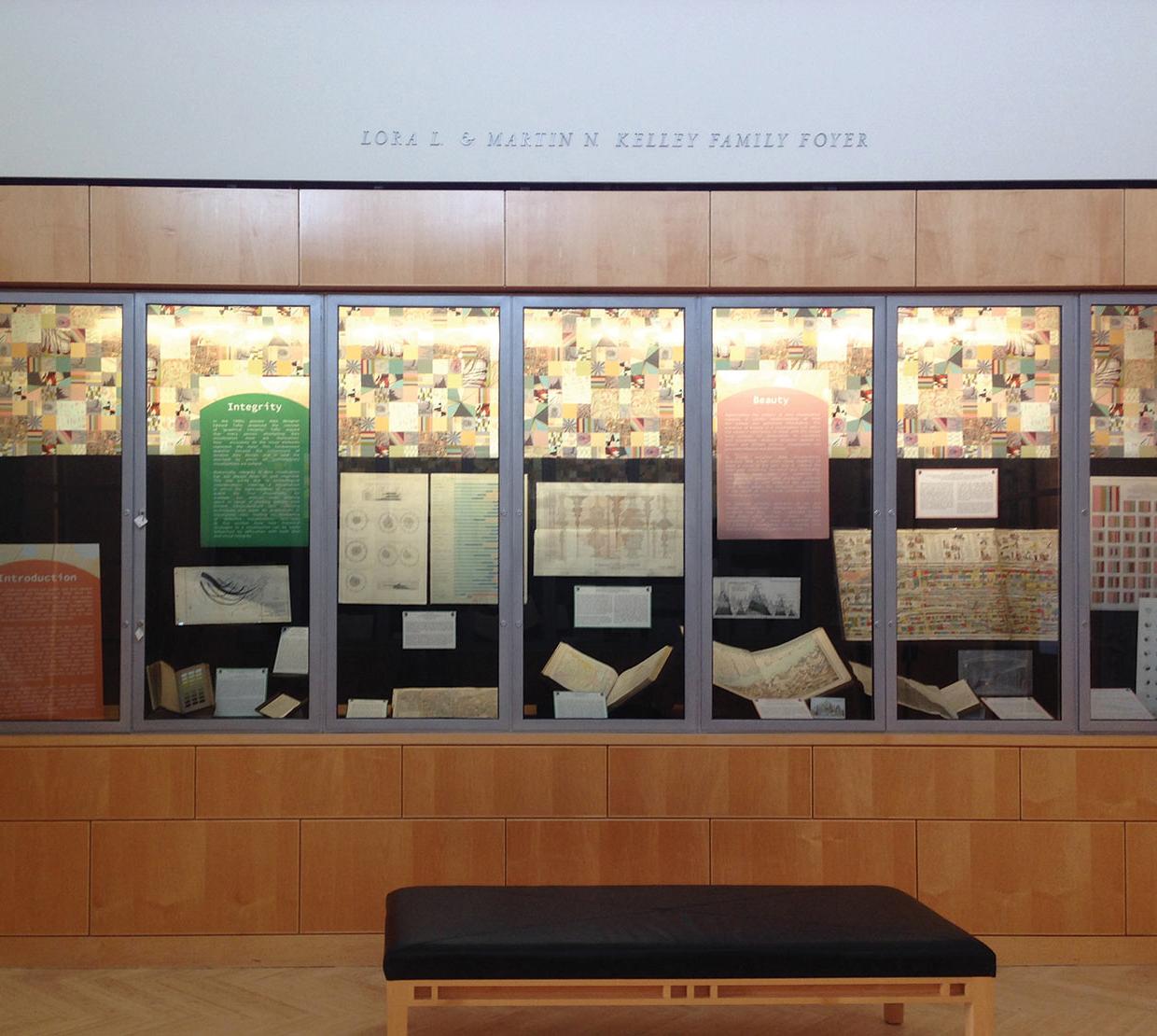
The exhibit is co-curated by Anne Bahde, rare books and history of science librarian, and Charlotte Wickham, assistant professor of statistics. It is open to the public until August 2017 in the Special Collections and Archives Research Center (SCARC), 5th floor of the Valley Library.
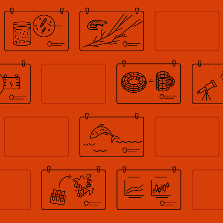
The exhibit showcases how the practice of visualizing data has inspired new insights in numerous fields and encouraged collaboration across disciplinary boundaries. Using examples of visualization from 1500-2016, the curators have grouped the great variety of data visualization into four different categories: integrity, beauty, utility, and novelty.
Bahde and Wickham have been working on the exhibit since July 2016. They combed through hundreds of archival collections and rare books held in SCARC to come up with illustrative examples that tell a very full and rich story of how data visualization has progressed to become a powerful and pervasive element of communication and knowledge in the present day.
“We are trying to show a diversity of visualization types and have taken examples from the papers of renowned scientists, artists, and researchers. The exhibit carries historical specimens with data from the sciences, social sciences, history, art, economics, natural resources, agriculture and more,” said Bahde.
Several events will take place around the exhibit. On Wednesday, May 3, a lecture panel will bring together three experts from different disciplines to examine the impact of data visualization on their work, and to explore the interdisciplinary connections that bring new insight to the study and production of visualized data. The speakers are:
Ehren Pflugfelder, “Elusive Elegance in Data Displays.” Assistant professor of rhetoric in the School of Writing, Literature and Film.
Ben Dalziel, “Data as Wilderness.” Assistant professor in the departments of integrative biology and mathematics.
Daniel Rosenberg, “Against Infographics.” Professor of History at the University of Oregon, co-author of Cartographies of Time: A History of the Timeline.
The lecture will begin at 5:00 pm in SCARC, 5th floor Valley Library. The exhibit is a part of SPARK: A Year of Arts + Science, a yearlong celebration of the intersection of the arts and science.